
Adventures in Rebranding + The All-New Dana Cubbage Weddings
January 4, 2017
published on
filed under
I just realized that I never blogged about my rebranding experience or my brand new website/blog! I’ll admit, the process was a long one… but it was TOTALLY worth it. I mean, I LOVE my new website, my new blog, my new logo… the entire thing. It turned out way better than I ever dreamed possible and I owe it all to my fabulous designer, Jen Olmstead.
We first started chatting about this project last fall 2015. Jen is SUPER talented and has worked with a TON of rockstar wedding photographers… so when she agreed to work with little-old-me, I was pretty much shell-shocked. I’m such a fan girl, so it was honestly a dream come true to have her work on my project. We got to work in early June 2016 and by mid-October, everything was live! Of course, that all happened in the midst of crazy-busy wedding season here in Charleston, so that’s why I never had the chance to blog about it.

Over the years, my brand + work has evolved and it wasn’t until I was pretty confident in my style that I was comfortable in working in Jen to rebrand and build a totally custom website + blog. Knowing my style, my clients, and the types of weddings I want to continue shooting helped me SO MUCH with this project. Every decision I made throughout the process was made with those things in mind… and the result is a brand and web presence that is so totally “me”! I’m just beyond thrilled with the results!
From the beginning, I knew I wanted to stay within the same “coastal” color family with my branding – but I also wanted to introduce a pop of color to add a fun, playful, slightly preppy vibe to my brand. Jen thought it might be a good idea to update my logo during this process and I was totally on board. I mean, she could’ve told me to jump off of a bridge and I would’ve done it… I trusted her COMPLETELY with my vision. After several different logo concepts, we landed on “the one”… and it was perfection! Jen was inspired by the iron gates of Charleston, along with the tradition of monograms down here in the South. I absolutely love it because it feels high-end, timeless, elegant… exactly what I was going for in terms of a new logo + brand.
When it came to my website + blog, I knew I wanted to move from a page-based website design to a more responsive, scrolling website design. While I absolutely LOVED my old website, I knew Jen could take that inspiration and create something a little more modern + updated for my clients. My new website and blog is simply gorgeous and so functional, which was really important to me. Having a strong web presence is so important when you live in a popular destination wedding location like Charleston. I wanted to make sure that my website + blog were recognizable + memorable… and I think we totally accomplished that!
Here are some screenshots of my new website + blog… it’s everything I wanted and even more than I could’ve imagined.

Thank you a million times to Jen Olmstead – the most incredibly creative, patient + fabulous designer a girl could ask for. Thank you to the team at Showit5 for all of the technical support throughout the implementation of this project. And finally, a HUGE thank you to all of my clients over the past 4 years for inspiring me and helping me create a brand that I absolutely adore. Cheers to an amazing 2017!!
With a well-worn passport in hand, and an affinity for a good cocktail, Dana works with fun-loving and kind-hearted clients around the globe.
meet DANA
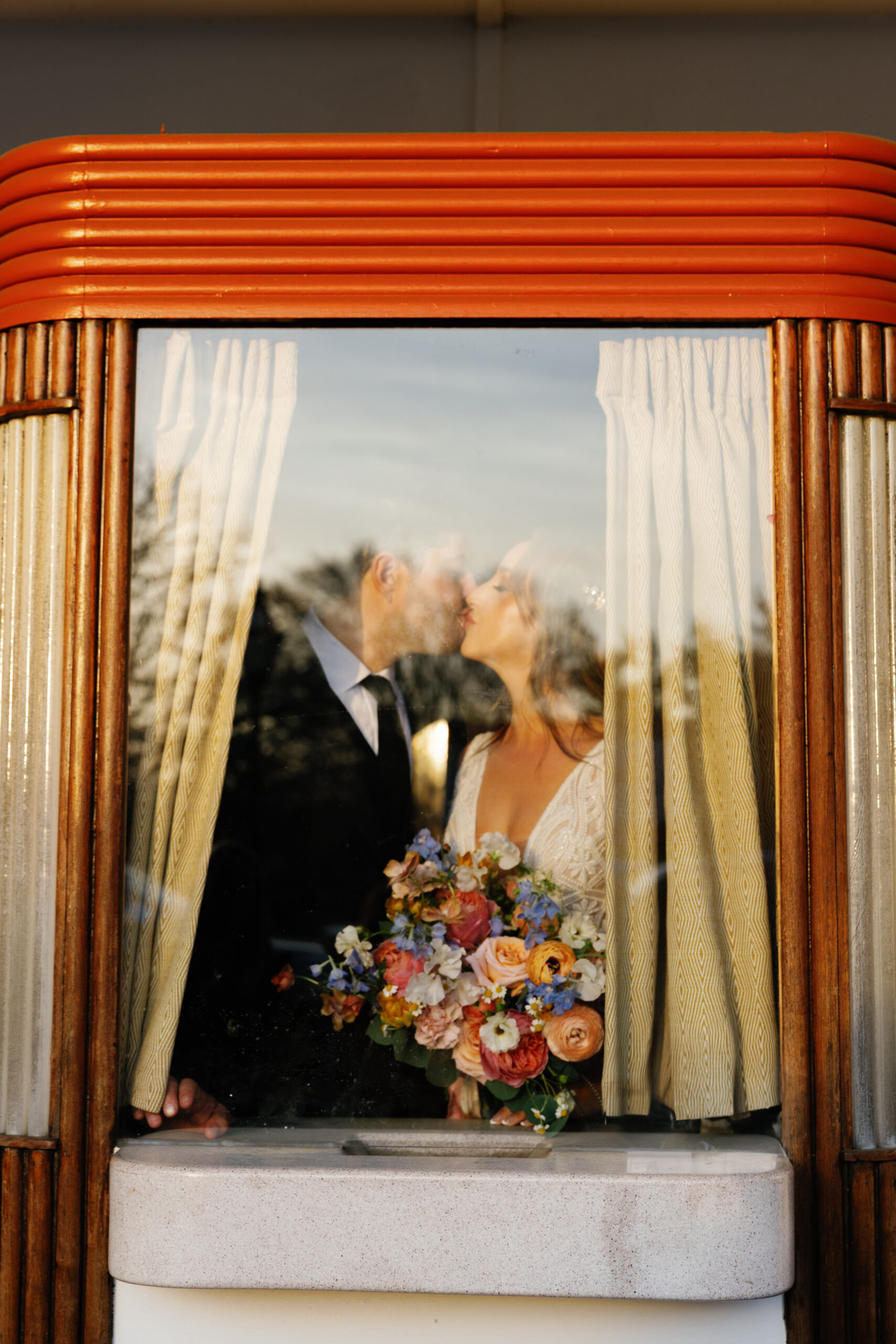
Becca + Stephen’s art deco inspired wedding at the American Theatre in downtown Charleston was one for the books! Their day was filled with so much love, joy, and thoughtfulness – I swear, the best weddings are always the ones that are centered around the couple and their family + friends. Sure, pretty details are […]
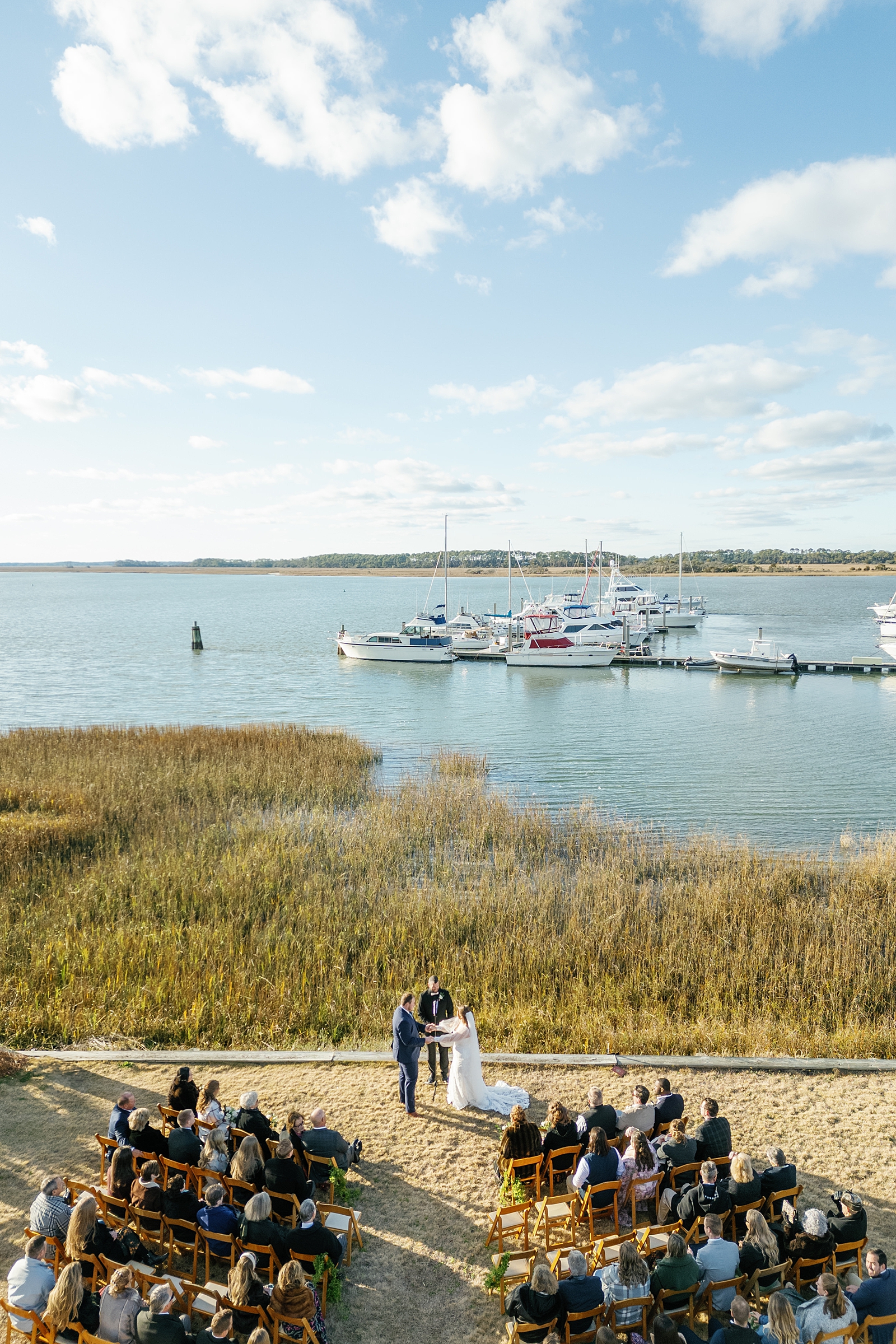
2025 got off to the very best start with Maggie + Britt! I absolutely ADORE these two and their wedding day was the perfect way to start the new year. Their shared love of the water and all of the natural beauty that the Lowcountry has to offer made the Regatta Inn a no-brainer choice […]
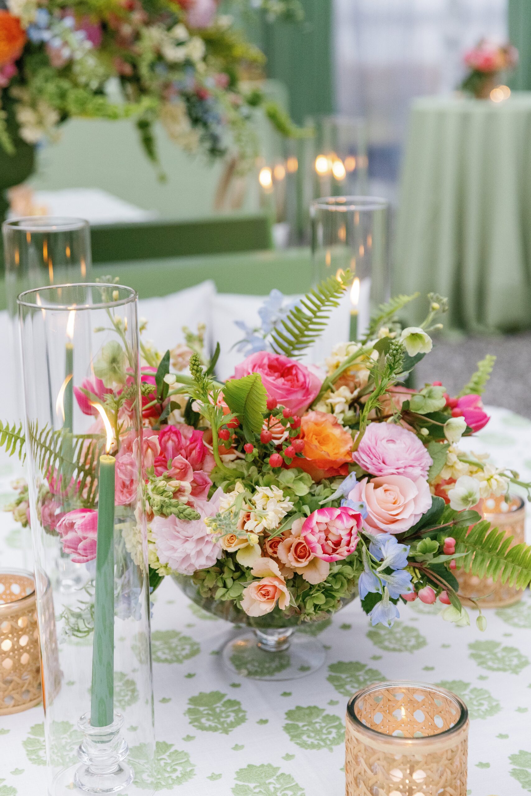
Payton + Connor’s rainy celebration at Lowndes Grove was the PERFECT way to close out the 2024 wedding season. When I first spoke with Payton, she told me that she envisioned a colorful wedding day – despite being married in late December. I LOVE that she went with bright florals and colors because it was […]
Hannah + Matt’s intimate brunch wedding at The Sanctuary on Kiawah was such a special celebration. If there are two things I LOVE, it’s an intimate wedding and brunch! Combine them together and it’s the perfect recipe for a memorable soiree. Can I specialize in brunch weddings? Pretty please?! I just love them! The morning […]
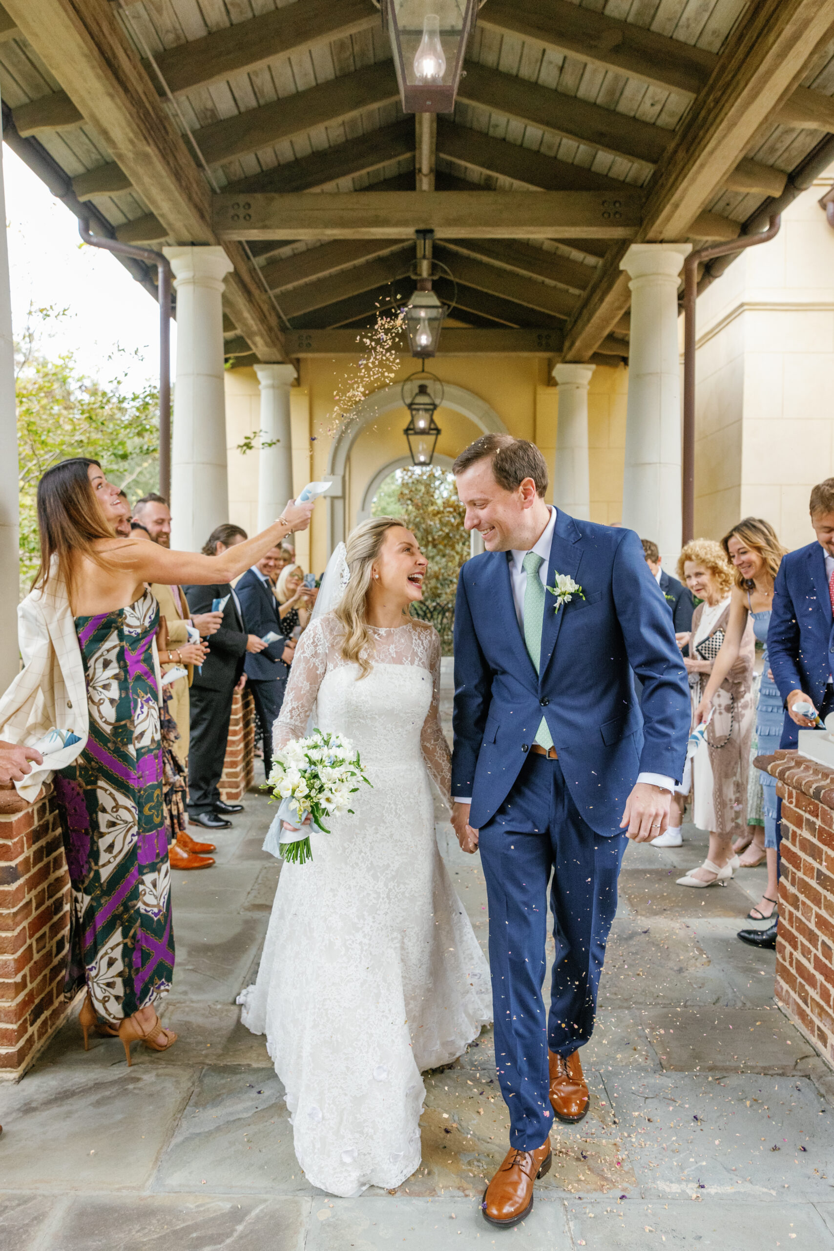
Ashley + Kyle’s wedding day was, in a word, magic. These two share such a beautiful love and I am beyond thankful to have witnessed it first hand. Ashley is pure JOY in human form and she absolutely glows in Kyle’s presence. The way they look at each other and care for each other is […]
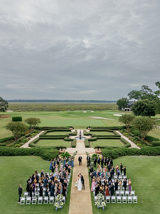
From the moment I first spoke to Sandra, I knew her wedding day was going to be something special. She had a clear vision of a day filled with special details, personalized moments, and a celebration of love that was truly unique to her and Matt’s love story. Being in the fashion world, I knew […]
entries
popular